

Frequently our clients ask for imagery that (to them) makes perfect sense to have on their new 180 by Design website. But often, their reasoning has little connection with the end goals of the website.
“I really like the color green because my grandmother had a green scarf.”
“I like the idea of the sea being on the website. I think that would communicate what I represent.”
In situations where clients are not familiar with how to communicate “What they do” through design, we tend to recommend for them to step away from their ideas and imagine how someone with a different perspective (in some cases: the whole world) might view the website.
Poor Design Communication
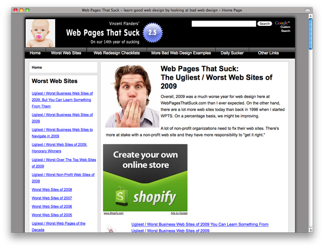
The imagery on this site begins to almost makes sense after a few minutes of concentration. They talk about websites that suck. Perhaps it could possibly make sense to have a baby sucking a pacifier right where we would (usually) place a logo. The first picture we see is of a guy who looks like he’s about to barf. He is obviously gagging because he is looking at websites that suck.
However, the first glance of these images, along with the tag line “On our 14th year of sucking,” gives a very strong impression that their own website is the one that, well, might make their own list. [Legal Notice: In no way am I outright saying that their website does, in fact, suck. Just implying.]
Good Design Communication
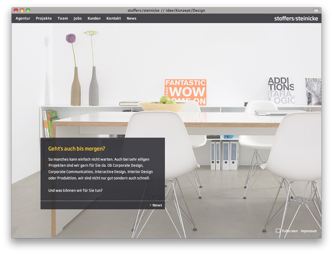
This Non-English website demonstrates just how well thought out imagery and an overall aesthetic can communicate so much in such a short time.
You probably got the impression that this German website is for a creative company. The variation in colorful objects against the far wall, the empty table with apples and a Macbook: they are almost beckoning clients to employ them in a new project.
(If you actually speak German you will get the added benefit of knowing they are, ”not only good but also very fast.“)
It is possible their potential clients will feel comfortable with their company within the first 2 seconds of entering their website.
Great home pages should have images that add function and value. They will communicate clearly and provide a comfy welcome mat to the visitor. Any other images will likely be distracting and unnecessary.