

Many websites are like those “Choose Your Own Adventure” children’s books. At each stage of the story you make your own decision about where to go next. But even those children’s books make the choice clear: Choose to follow the Ninja and see what he’s up to: Turn to page 48. OR Follow the Gingerbread Man and learn how muffins are made: Turn to page 133.
Many home pages don’t offer any choices. Instead, they just leave the visitor staring at a chaotic screen with no clear direction on where the owner intends for them to click next. This is Mistake #2.
Great websites will give clear recommendations for a range of different types of visitors.
“New to our company? Here is what we do.” “Already know about us? Would you like to skip to our contact information?”
These questions do not have to be stated so obviously, but can be asked through design.
Bad Direction
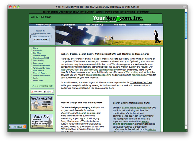
Seeing this home page is like walking into a lobby and having 20 people standing around, each quietly whispering completely different questions, simultaneously! You walk in, and what do you feel? You’d like to walk right out the door. The design of this home page does nothing to welcome the visitor and show them around.
Notice the overload of small print questions asked on the page. “Check availability.” “Need a website.” “Ask a pro.” But the questions themselves aren’t asked in any particular order. What is the point? What action are we supposed to take?
Good Direction
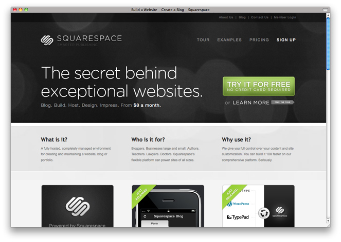
Squarespace has done a great job giving multiple audiences direction – each of whom will most certainly have different intentions when entering the website.
For a person who already knows Squarespace’s services there is a clearly-placed “try it free” button in primary visual space. There is also a “sign up” button that is seen within 2-3 seconds of visual engagement.
For a person who is unsure of what they do, the most primary focal point on the page is the large text which includes “exceptional websites.” This instantly clues us in to the fact that they are involved in making websites happen. To learn more, there are clear 3 columns to choose from: “What is it?” “Who is it for?” “Why use it?” There is also a nice large “Learn More (Take the Tour)” link.
Here is a great example of clear direction for visitors. It even includes instructions that apply to visitors with different needs.
The best websites make a visitor’s choices so easy that they won’t realize they even had a choice. Instead they will simply exit the site after having their unique needs met.