

A company’s purpose must be vividly clear. When a visitor arrives on your home page, they must be immediately drawn in to your company’s unique specialty.
If the design and imagery communicates your company’s purpose, it doesn’t have to be repeated through words. But it rarely hurts to “say it” twice! Make your message obvious.
Mistake #1: Under-communicating to your site visitors and making them guess your company’s purpose.
Your message should be blatantly ingrained into a visitor’s train of thought. If a visitor glances away from your website, or closes their eyes after first seeing the home page – they should immediately remember the main idea.
Poor Communication
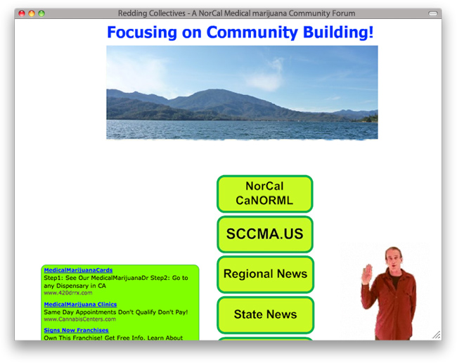
You might think you know what reddingcollectives.com focuses on by this snapshot – but believe me you don’t. Not until you’ve heard from narrator Baron Galocy speak to you for about 25 seconds will you understand that you’re actually here for news about marijuana.
Our friendly on-screen narrator has to explain what the site is about because, you guessed it, that purpose is not readily apparent.
As a news website the best thing he has to offer is NEWS, yet interesting enough – you won’t find any marijuana news until you’ve journeyed a few clicks into the website.
Great Communication
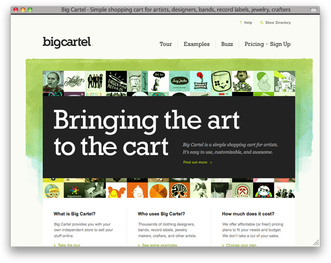
Indie Labs’ bigcartel.com website is, as the subtext reiterates, a “simple shopping cart for artists. It’s easy to use, customizable, and awesome.”
And this website itself is (indeed) “easy to use and awesome.” The message is clear and distinct. They have a niche market, yet somehow made a design that is large-audience accessible.
They have summarized the 4 things you could ever want into 4 links at the top, the last being “Pricing + Sign Up” – a clear call to action.
BigCartel has done most of the heavy lifting when it comes to selling the product. The only thing left to hinder sales is an artist’s cheap pockets!
Make sure that from the start your website message is clear, distinct, and to the point.